The Libero’s Dilemma:
5 Iconic High-Contrast Designs That Demand Attention
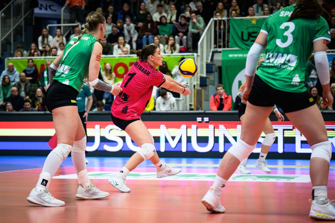
For kit designers, volleyball uniforms pose a unique challenge. It’s not really something we see in other sports. According to the game’s official rules, the libero’s jersey must be clearly different from those worn by their teammates and instantly recognizable to officials and fans.
The libero needs a clearly distinct jersey, but it should not look so disconnected that the player could be mistaken for a member of another team. The challenge is therefore to create an obvious contrast while preserving a clear visual connection to the rest of the team.
Why the Volleyball Libero Jersey Has to Look Different
The contrasting libero jersey is not simply a design choice; it is required by the official rules. There is a good reason for this: officials and fans need to identify the libero quickly during rallies. As the team’s defensive specialist, the libero is subject to specific playing restrictions. This is especially true during high-stakes games, where play moves at exceptional speed. These are the specific rules:
- According to the official FIVB (Fédération Internationale de Volleyball) rules, the dominant color of the libero’s jersey needs to be unique, different from the other players on the squad.
- Further, it needs to clearly contrast, not just be a slightly different shade of the same color. Or an addition of a distinctive stripe or trim; that’s not enough.
For the designer, it’s more than just ticking the required boxes. The strongest custom designs take the two kits as a visual set, different yet complementary. We’re going to give you some examples of teams that have successfully done this, retaining a connection between the libero and their teammates, without breaking the rules.
Australia’s Indigenous-inspired Volleyroos Uniforms
In 2022, the Volleyroos unveiled a kit that carried significance beyond the court, placing Australia’s relationship with its Indigenous peoples at the center of the design. Part of Australia's Reconciliation Action Plan, the jersey was designed by Brad Hore, a two-time Olympic boxer and Dunghutti man.
Hore retained Australia’s familiar green-and-gold palette. But the crucial difference was the indigenous artwork across the entire jersey. The artwork was not merely a decorative detail; it formed the foundation of the design.
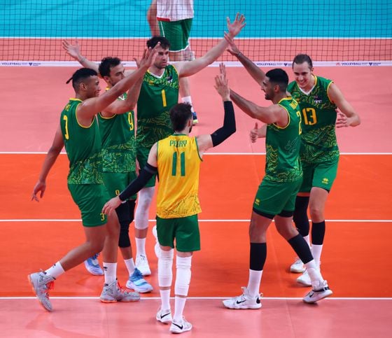
While a distinct gold colorway made the libero instantly recognizable, the uniform retained the collection's core graphic language. The contrast made the libero immediately identifiable, while the shared cultural motifs kept the uniforms visually connected and reinforced the kit’s message of reconciliation.
Brazil’s Yellow and Blue (featuring Serginho)
Brazil’s kit may be one of the clearest examples of a libero’s jersey becoming closely associated with a particular player. Serginho, one of the sport’s defensive greats, made the yellow and blue jersey an iconic part of Brazil’s visual identity.
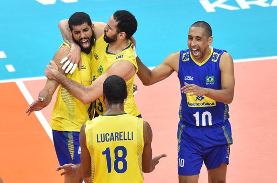
When you think of Brazil, it’s the samba colors that immediately come to mind: yellow shirts, blue shorts, and a splash of green like the country’s flag. They are the colors of the Seleção; no matter the sport, one of the most recognizable combinations in the entire world. The challenge is to create contrast without losing that unmistakably Brazilian identity.
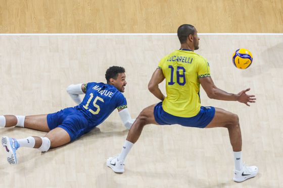
The solution? 100% blue for the libero. It’s bold, but not at all random, because blue is already part of Brazil’s sporting identity. In the country’s soccer history, for example, the ‘away’ kit has often been blue, including the memorable 1970 kit (when Brazil won the soccer World Cup).
In this case, designers decided to use existing country colors to establish the contrast, using what’s traditionally a ‘home’ and ‘away’ design in other sports. And with Serginho acting as libero for many years, it helped establish the custom design as an accepted staple, with Maique Reis Nascimento carrying the tradition in today’s squad.
Japan’s Red, Black and White Graphic System
Japan is always an interesting case in jersey design. Japan’s national team jerseys often attract buyers far beyond the country’s own fan base. Just do a quick Reddit search on Japanese volleyball products, and you’ll get a sense of the hype these jerseys can create.
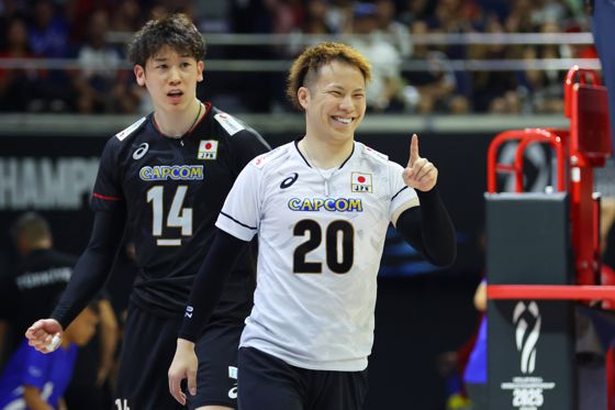
In a match between Japan and China, a white outfield jersey with a black libero design was showcased. Similarly, the previous iteration of the design flipped those colors. It has tonal patterns and subtly uses shades of black, fitting the Japanese aesthetic without being too loud.
In recent years, one of the team’s main sponsors, Capcom, has provided another recognizable Japanese element while appearing consistently across both uniforms.
USA Olympic Navy, Red, and White Combinations
Team USA’s designers begin with a comparatively simple task. The existing palette already provides a strong, built-in contrast, meaning it’s almost ‘job done’ from the get-go. But that doesn’t mean that you can’t do something interesting with it.
Usually, white and/or navy is used as the primary base. Red can then serve as the bold accent, making the libero easy for officials to identify. In a recent game between the USA and Italy, we saw that exact combination. The standard uniform combined a white jersey with navy shorts, while the libero wore a solid red shirt, completing the national color palette.
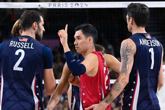
The contrast feels natural because red, white, and blue are so strongly associated with the United States. Designers can use the interplay between the three colors to build a national identity, while respecting the uniform rules of the sport.
Poland’s Red, White, and... Green?
Poland has one of the strongest and most passionate fan cultures in international volleyball. There’s little room to mess with the flag’s colors, or you can expect hate mail from the country’s faithful. Fortunately, Poland’s primary colors, red and white, work perfectly for an easy-to-read design contrast.
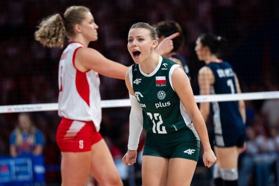
The country’s most recent kit design, however, has interestingly broken the pattern. Green has recently been introduced as a third color. Depending on the match, it may be worn by the libero while the rest of the team wears red and white, or vice versa.
In this case, Poland's kit designers had to answer the question: how can we use unique patterns and colors, but not discard the traditional red and white combination that Polish fans expect? Rather than separating red and white, the designers retained both national colors and introduced green as the contrasting option. The approach shows that there is no single formula for contrast and that new colors can be introduced without abandoning tradition.
Different, but Still One Team
The libero’s jersey design must catch the eye immediately, allowing officials and spectators to distinguish the player in accordance with FIVB rules. But once that happens, the designer’s creativity can shine through.
The colors may differ, but shared patterns, typography, numbering, and trim can preserve a unified team identity.
Brazil relies on a simple color reversal, Australia uses shared Indigenous artwork, and Team USA draws on its recognizable red, white, and blue palette. Each libero’s jersey stands out during play, yet thoughtful use of color, graphics, and typography ensures that the team still looks like a single unit.
Image credits Title image: IMAGO / Conny Kurth; Image 2: IMAGO / Pond5 Images; Image 3: IMAGO / Newspix; Image 4: IMAGO / Xinhua; Image 5: IMAGO / AFLOSPORT; Image 6: IMAGO / Panoramic by PsnewZ; Image 7: IMAGO / NurPhoto